52 treinta

They came to us to develop the concept and identity of 52 treinta, a Mexican brand of mountain apparel and accessories. They wanted to express a warmer, more relaxed way of living sports, with Mexican humor and one clear idea: not everything has to be taken so seriously.
Our challenge was to turn that intention into a brand with a personality of its own. We had to define what it stood for, how it spoke and how it looked, and build a system that could carry it through its products, its communication and the gatherings with its community.
- Brand identity
- Brand strategy
- Product development
- Communication
- Digital experience
Understand
We started by listening to Pablo. First through his Brand Discovery and a workshop, then by reviewing 24 mountain brands from Mexico and abroad.
It seems that to climb a mountain you first have to prove you belong: have the gear, the stamina and a feat to tell. That image can intimidate anyone who wants to get closer. In the workshop we found that, more than the price, what weighed on people was the embarrassment of falling behind, of not knowing enough or of not fitting in. The mountain drew them in, but they didn't feel there was a place for them.
Define
The strategy was to bring the mountain into everyday life. We found an opportunity in enjoyment, Mexican humor and the stories of real people. From there came a brand that invites you to move at your own pace and makes taking the first step feel easier.
“Sport doesn't have to be so serious” became the idea that guides 52 treinta. An invitation to move for the fun of it, laugh along the way and enjoy without having to prove anything. From the language to the images, every decision of the brand aims to take the pressure off and spark the urge to get outside.
Identity.
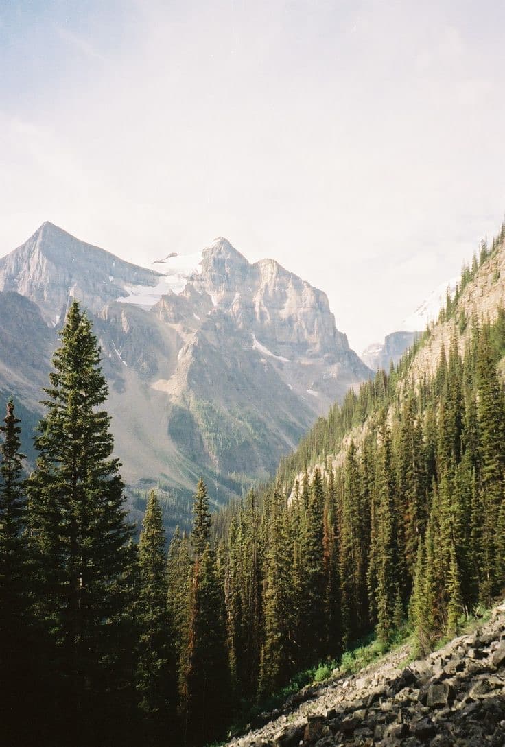
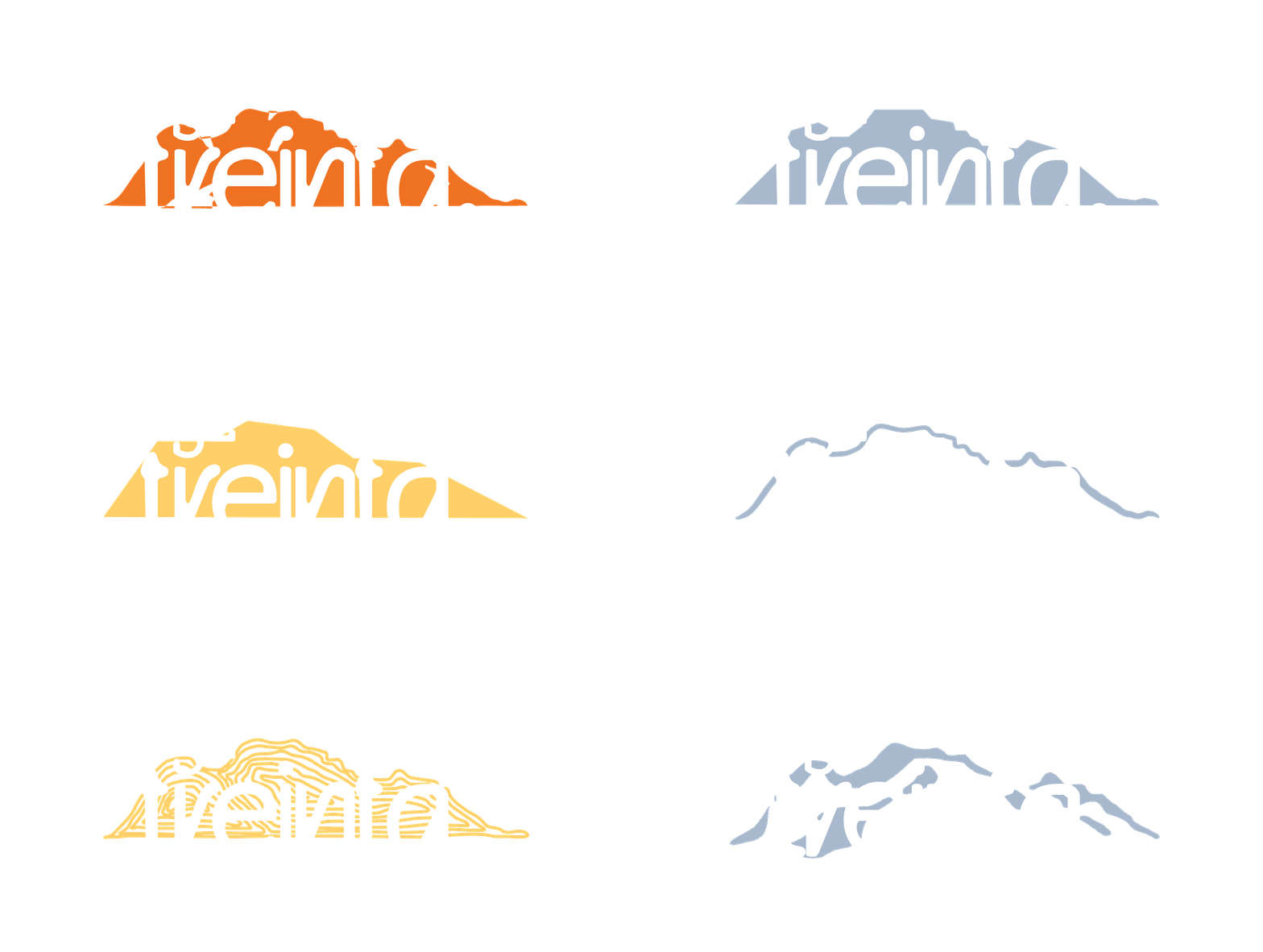
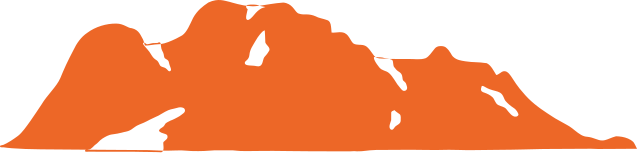
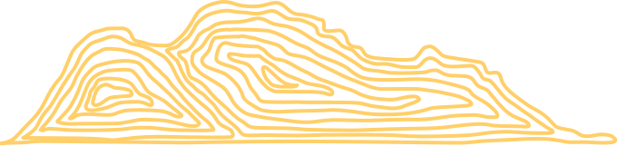
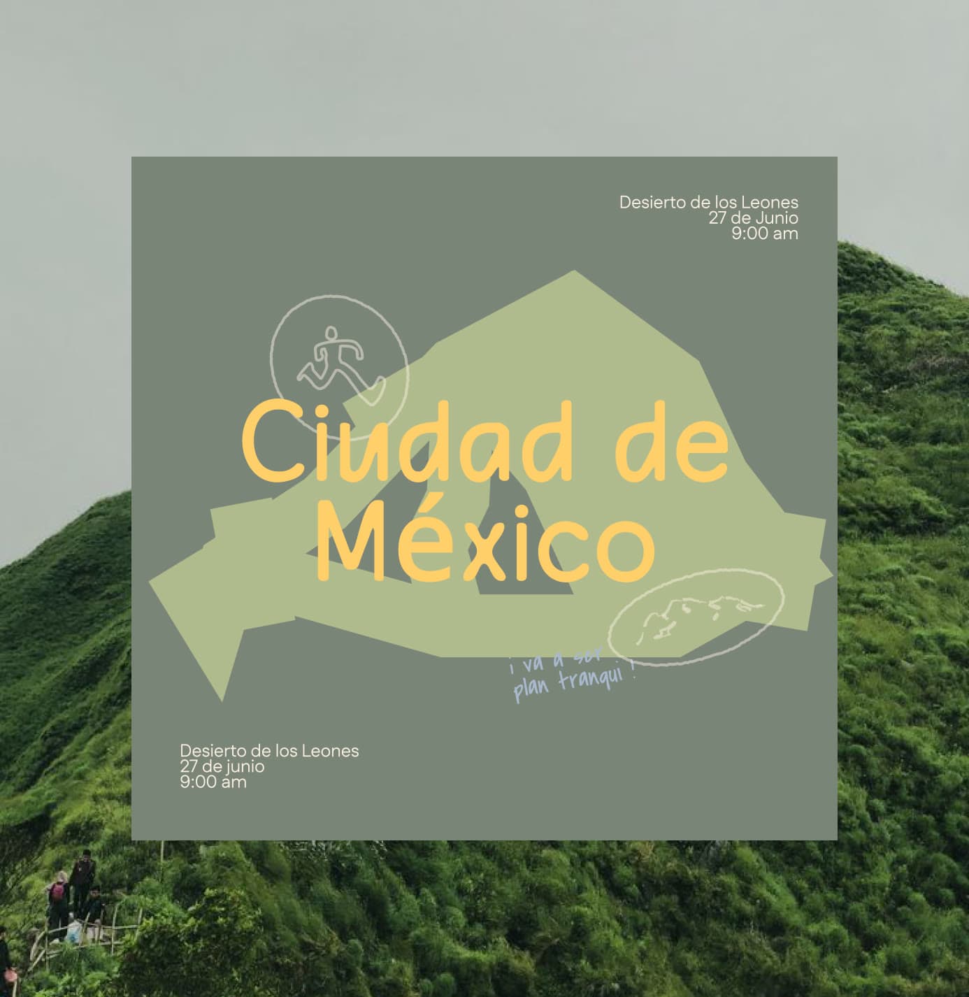
The mountain never looks the same twice, and neither does the logo. We gave it eight mountains that change shape and eight colors drawn from the landscape.
The symbol has a mother shape, but it can change its expression depending on the context. The mountain is never the same twice. Neither is the brand.
Each color stands for a part of the landscape and the culture that inspire the brand. Together they form a system that balances the calm of the mountain with the warmth, diversity and vitality of Mexico.
We didn't want a technical voice or a distant premium look. We wanted letters with character that never feel forced. A typeface that feels like it's from here, that moves with you and invites you in.
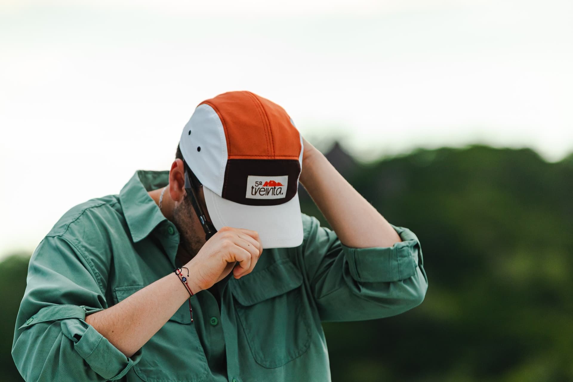
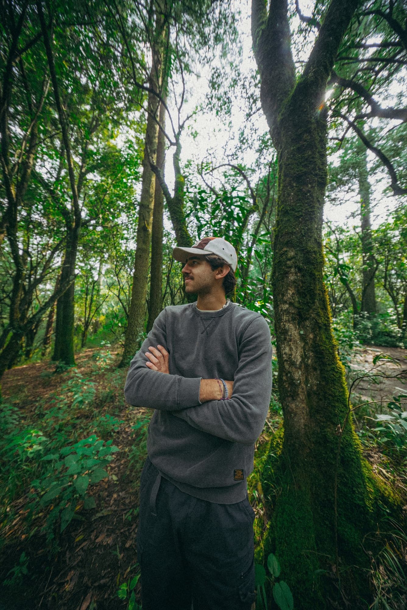
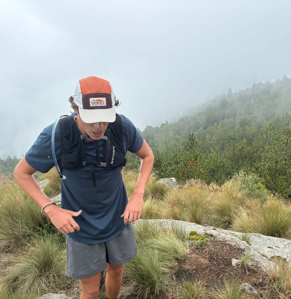
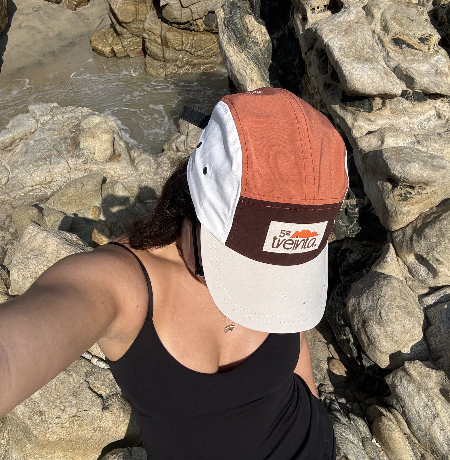
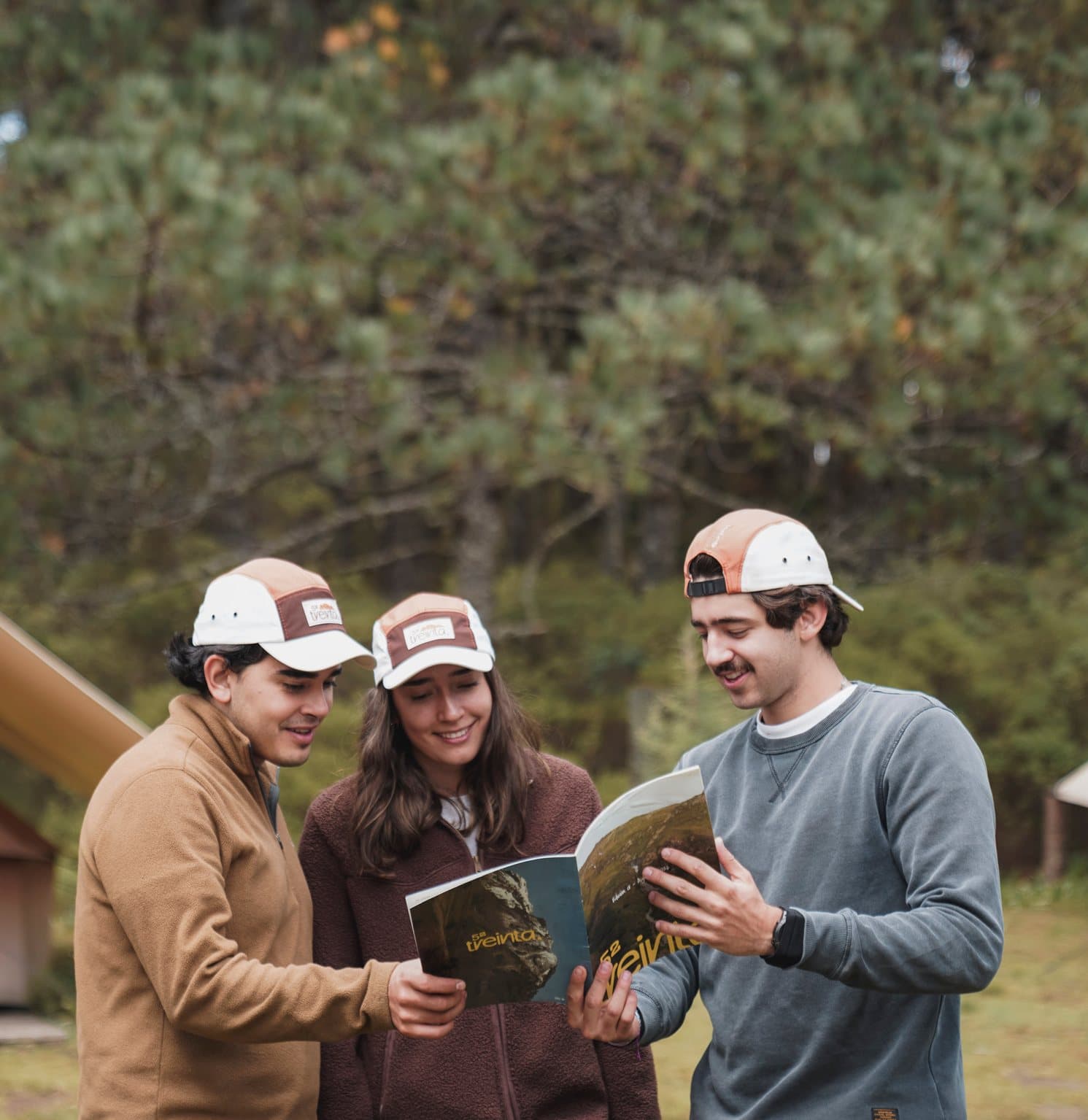
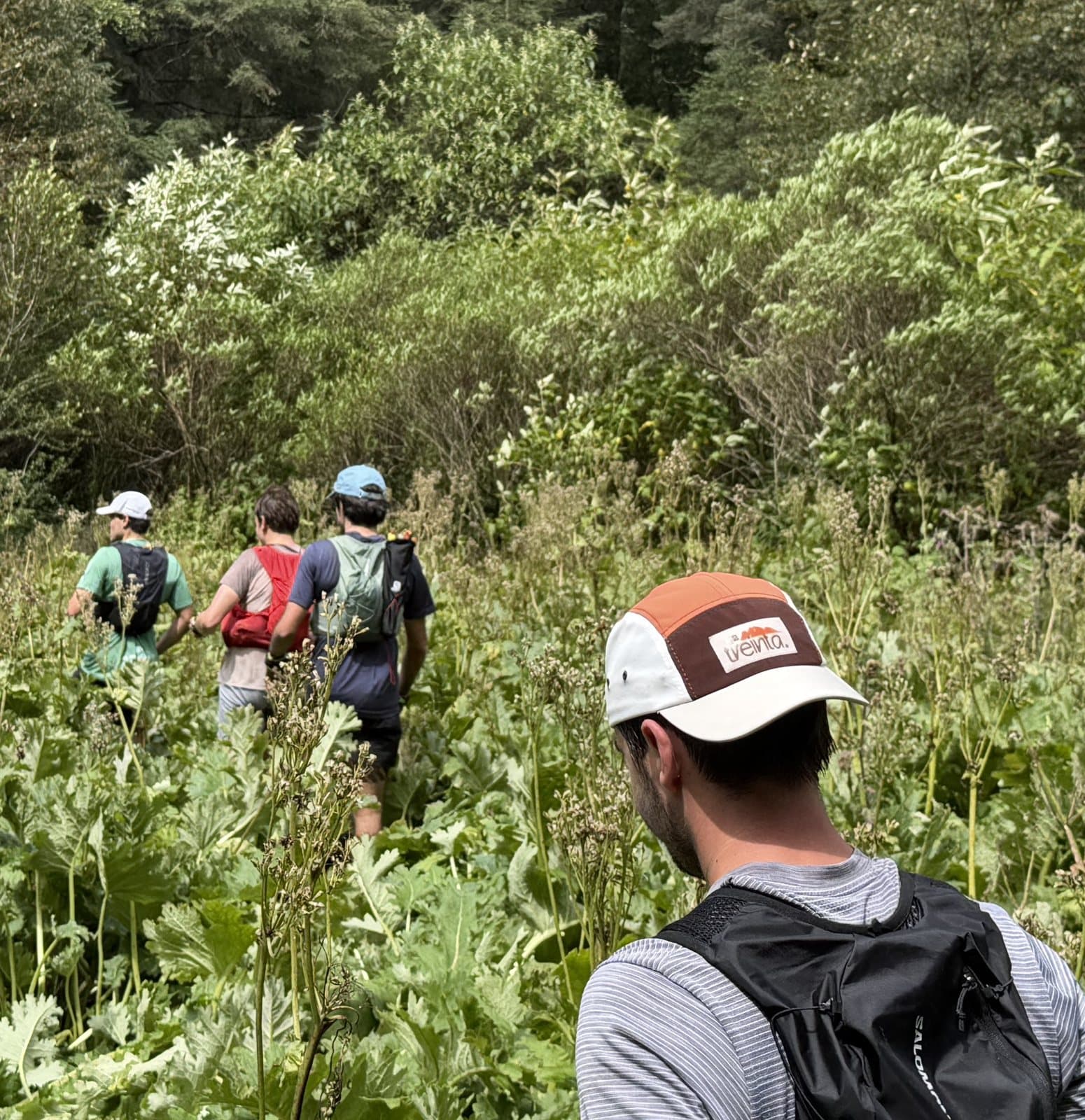
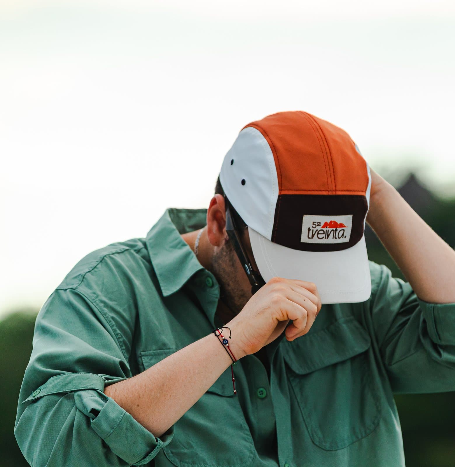
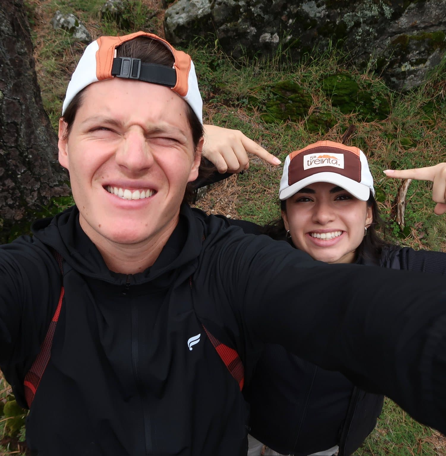
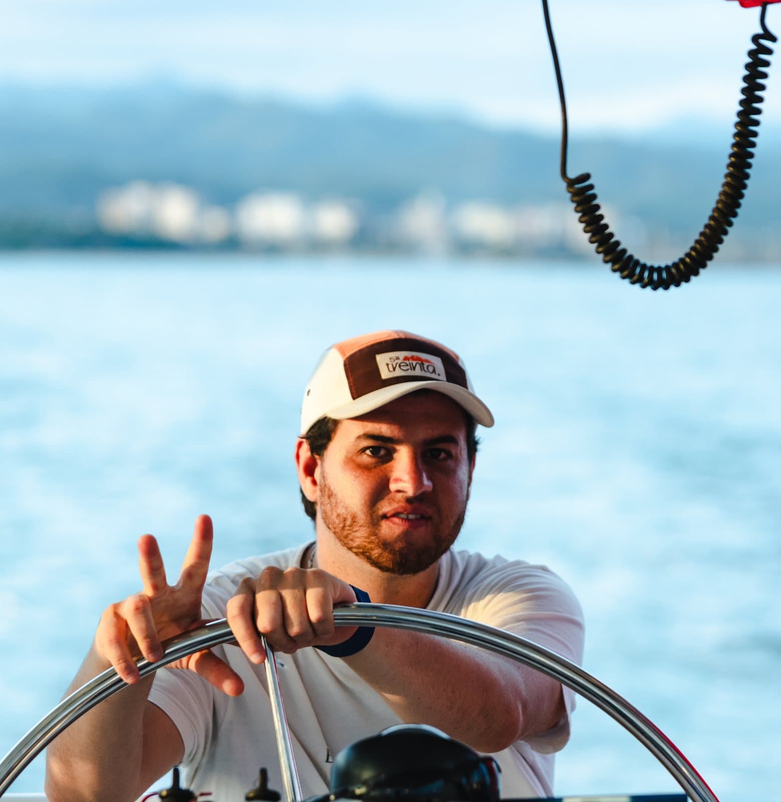
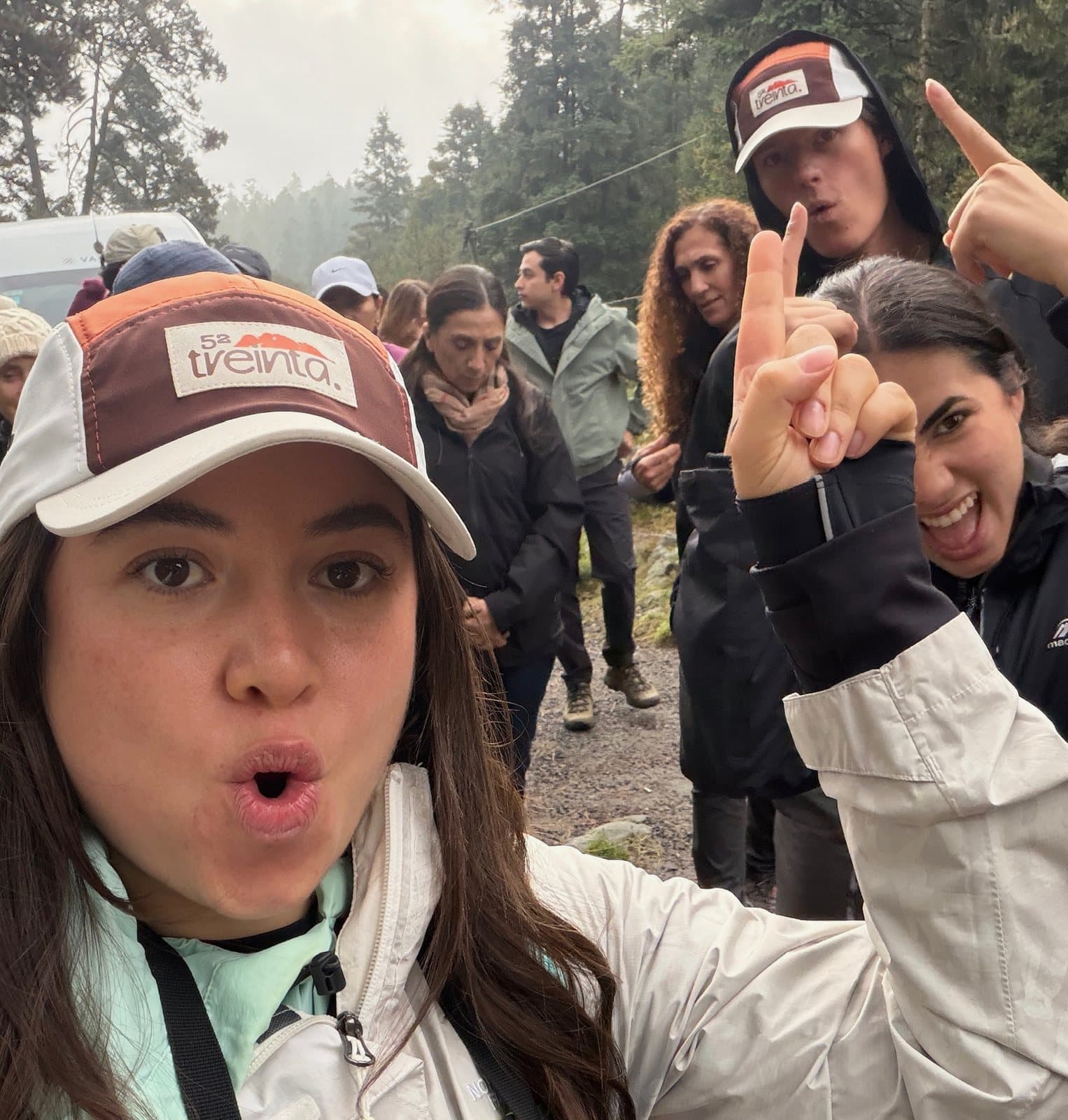
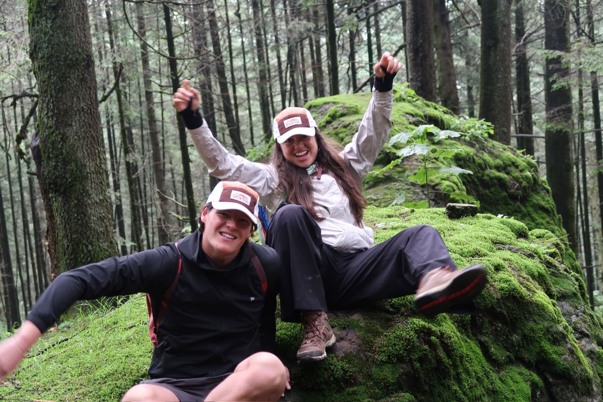
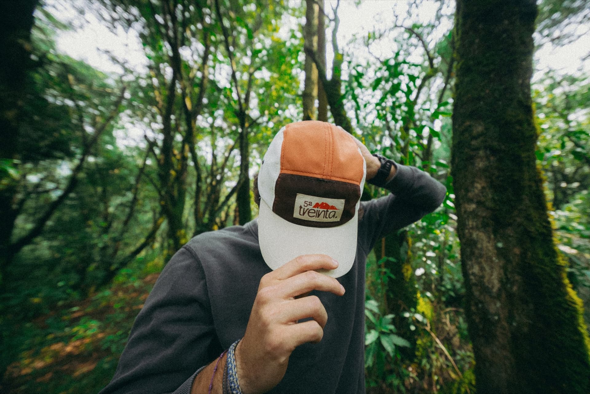
The cap brought the 52 treinta universe into an everyday piece. We carried the brand's graphic language into an object that can go with you up the mountain, out for coffee or wherever the plan takes you.
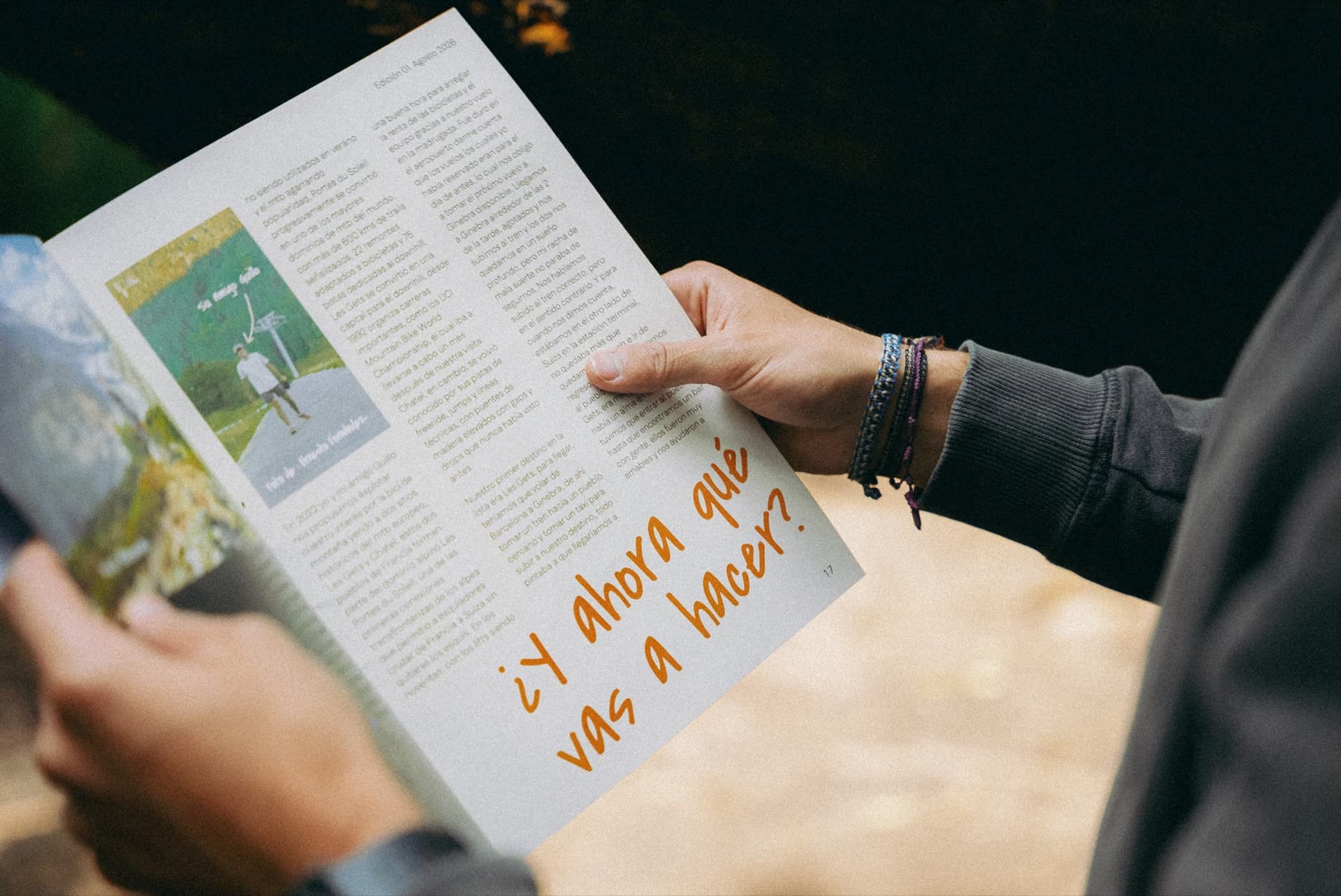
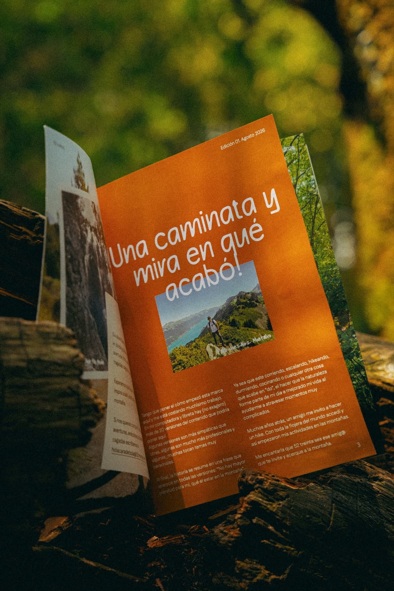
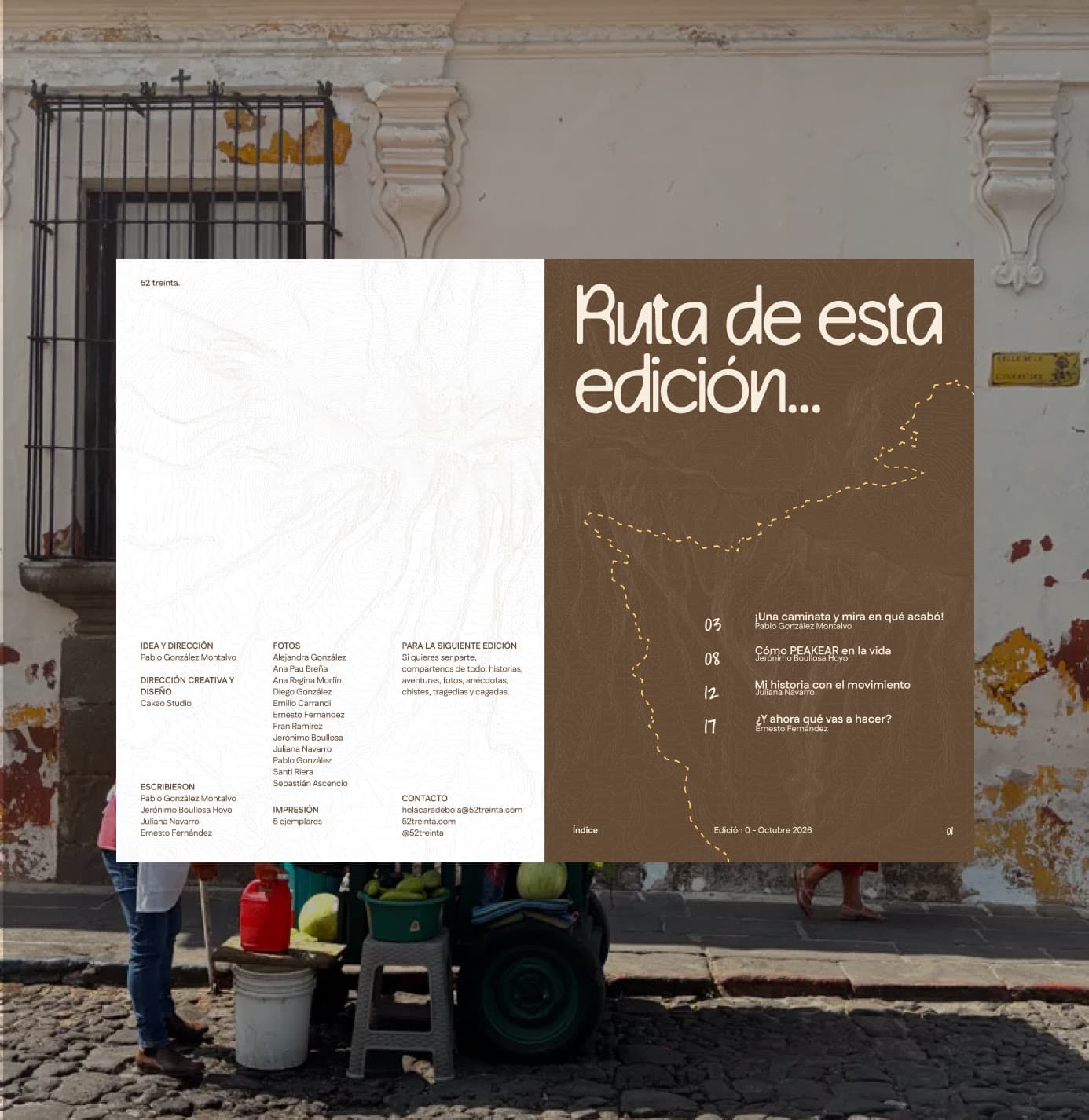
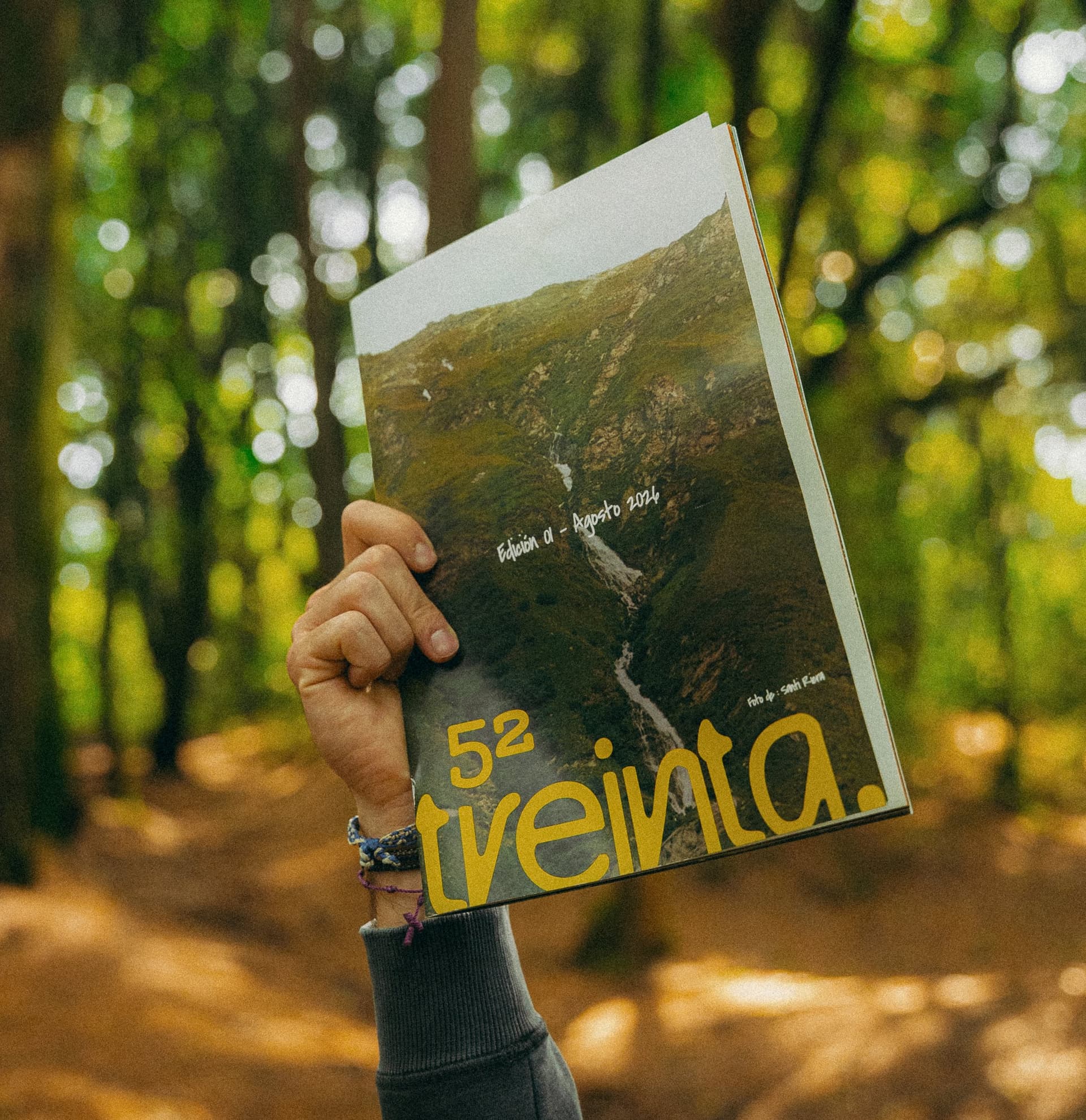
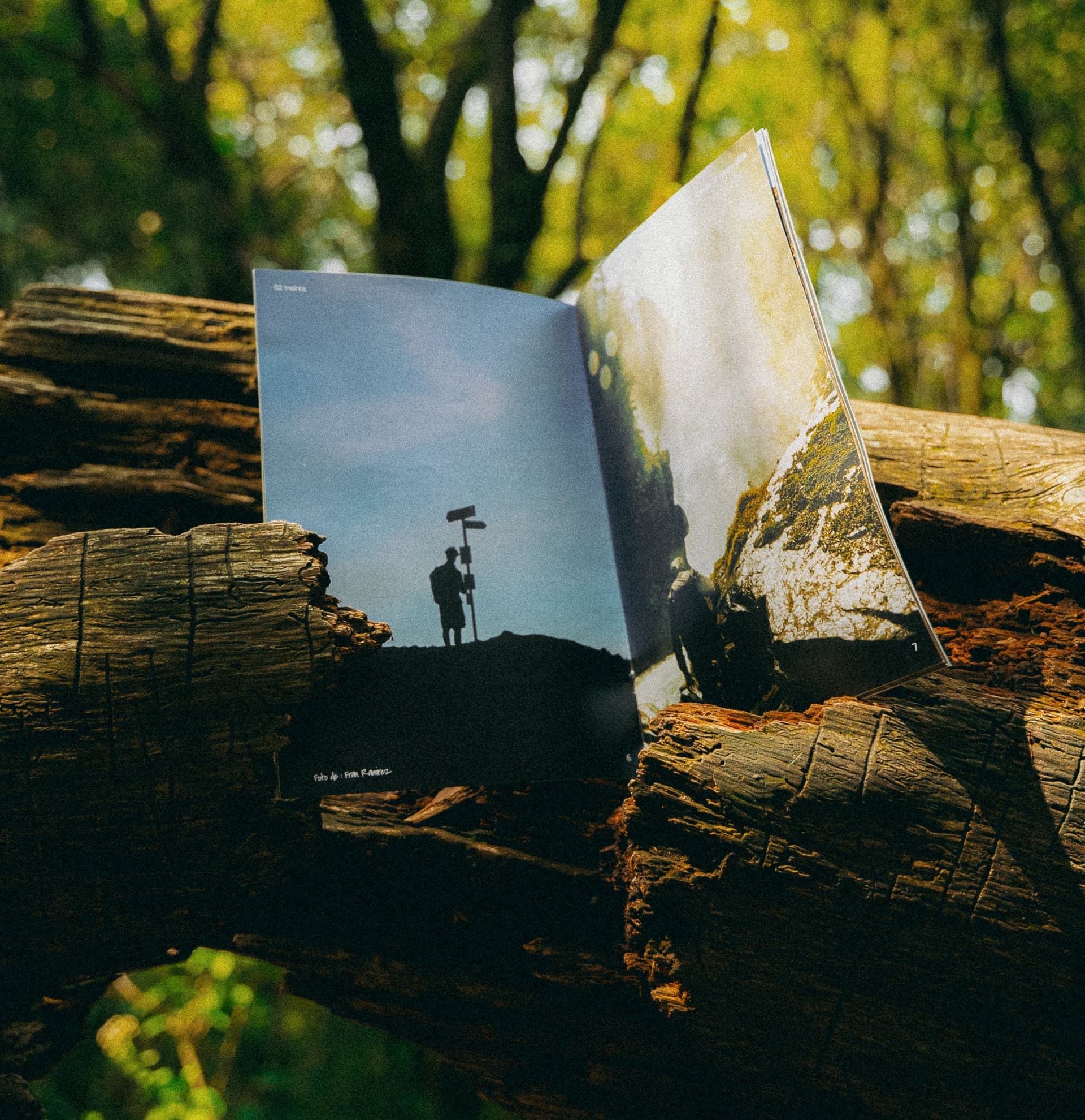
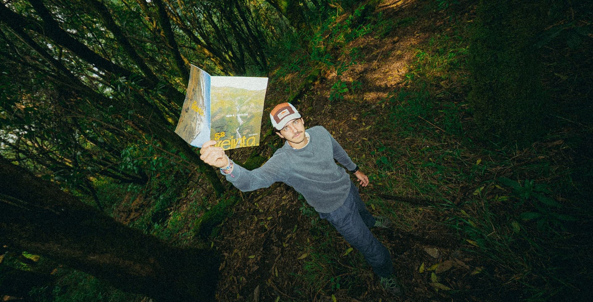
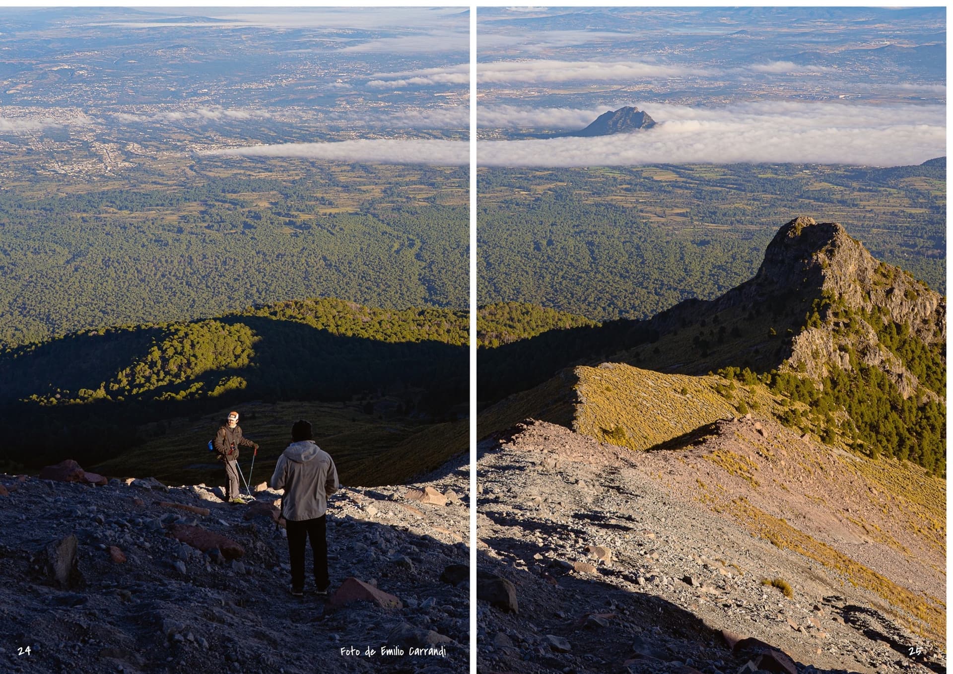
52 treinta's stories are made by its people. Their outings, wild ideas and anecdotes bring the brand to life. We created the magazine as a place to gather those voices and show that everyone has their own way of living the mountain. Stories that make you want to head out and come back with one of your own.
We brought the 52 treinta universe into a digital experience where the products and people's stories meet. The humor, the images and the small details make exploring the brand feel as close as a plan to head up the mountain with friends.




Create
The shape that idea takes. An identity that changes like the mountain, a cap to start with, a magazine for the community and a website where it all comes together.
Every piece comes from the same idea and is recognizable on a cap, in a magazine or on a screen. Everything speaks Spanish, as Pablo asked from the very beginning.
Implement
The website went live in a session with Pablo. The first Instagram post went out right there, and at the August bazaar the magazine was shown for the first time, along with some exchange postcards.
Since the launch, people have been leaving their stories on the website. What comes up most is not having anyone to go with, or not knowing where to go. That's what 52 treinta is for: to be the friend who invites you to the mountain.
Closing
We left a complete system and a brand book to use it. The logo, the eight mountains, the palette, the typography and the voice, ready for every new piece.
With that, 52 treinta is recognizable on a cap, in a magazine or on a hike, and whatever comes next comes from the same place.
Evolve
What comes next, we build with the community. New stories for the magazine and new pieces, always from the same system.
The idea stays the same: climbing should be an excuse, not a test.
Thank you
Photography: Acostus, Mich García, Pablo González, Emilio Carrandi and Alejandra Gonzalez.
Thank you to Pablo and the whole 52 treinta community.
Shall we start yours?